Lutheran Services Queensland
In an increasingly competitive world of different Home Care providers, Lutheran Services Home Care stands out. Not just because it offers outstanding services — that’s a given. But because it offers something much more important: moments of shared joy.
The brief
Lutheran Services has traditionally marketed Home Care by anchoring it to a local aged care or retirement village. But they knew a wider market existed for these services. And that market is competitive. For that reason Carbon was engaged to create a Home Care brand look and feel they could take to the world that reflected their larger brand and their key values.
The good
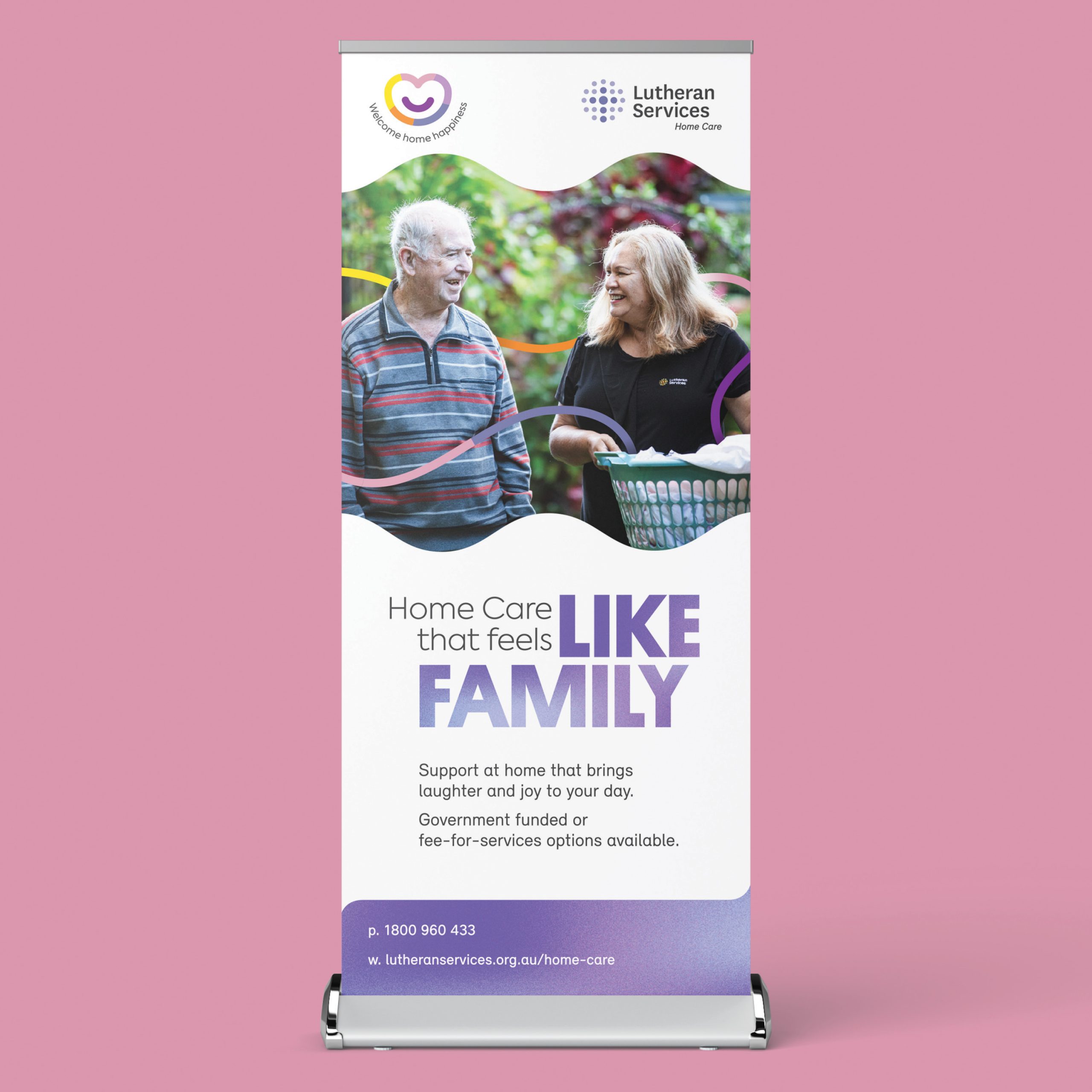
Where other home care competitors are very process driven, Lutheran Services Home Care is all about the experience clients have with them. That’s why their brand promise is: “Have the confidence to continue living at home, supported in ways that make your heart smile”. They’re not just about providing practical services, they’re about sharing moments of joy.
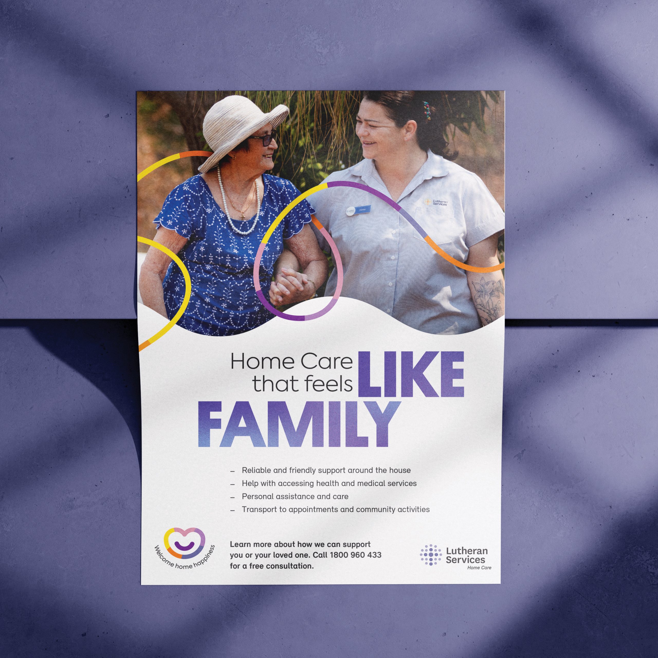
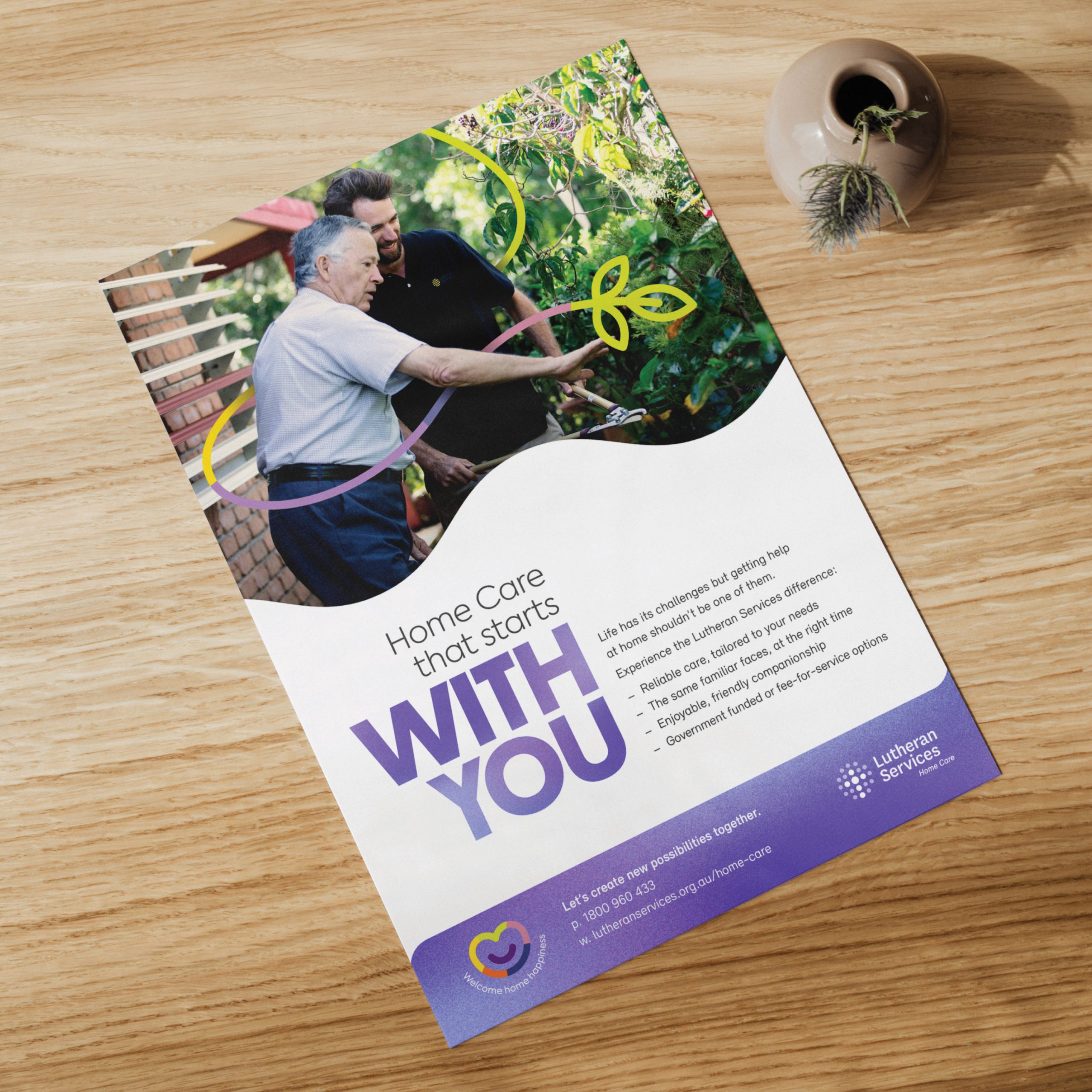
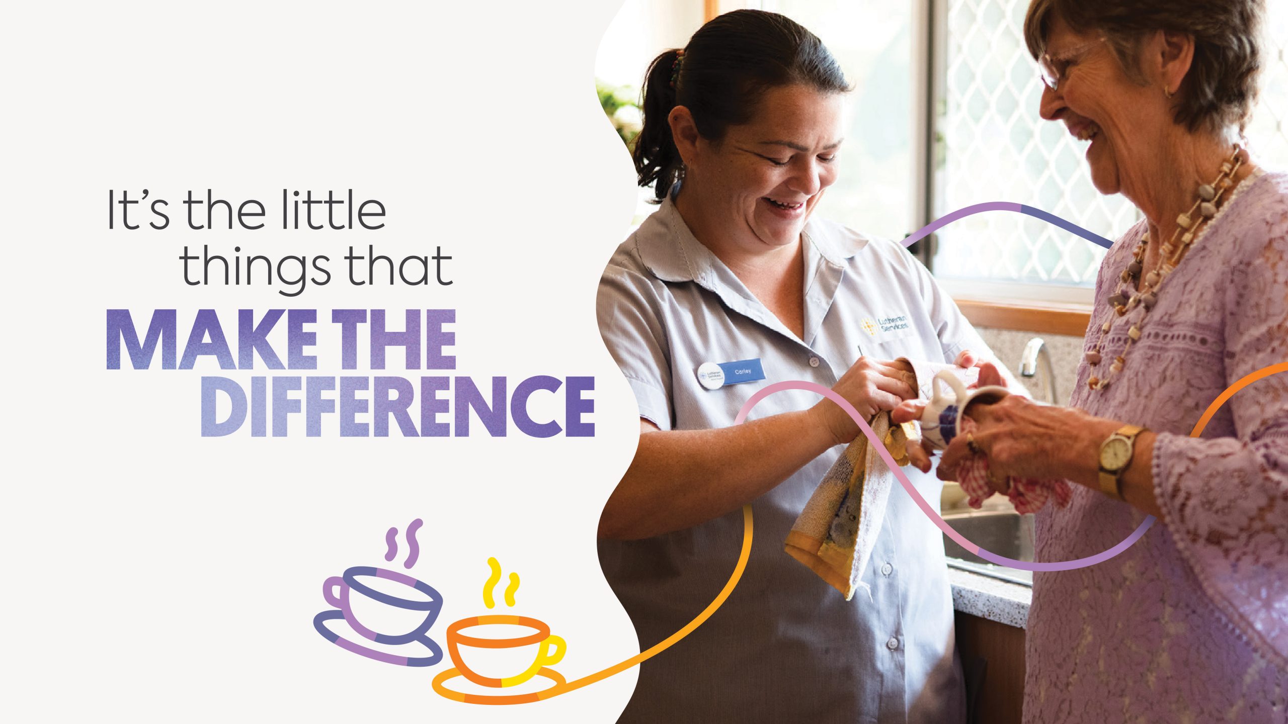
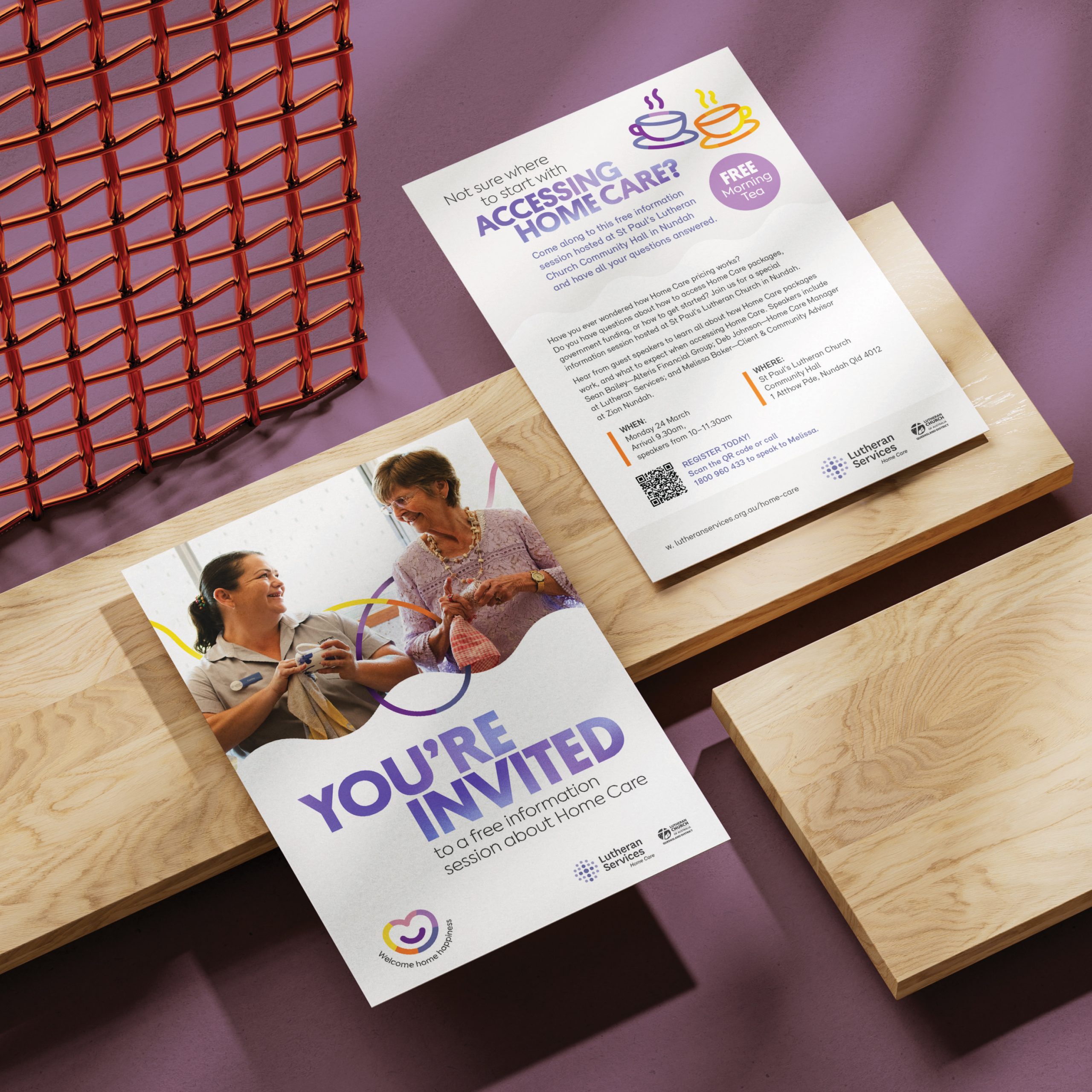
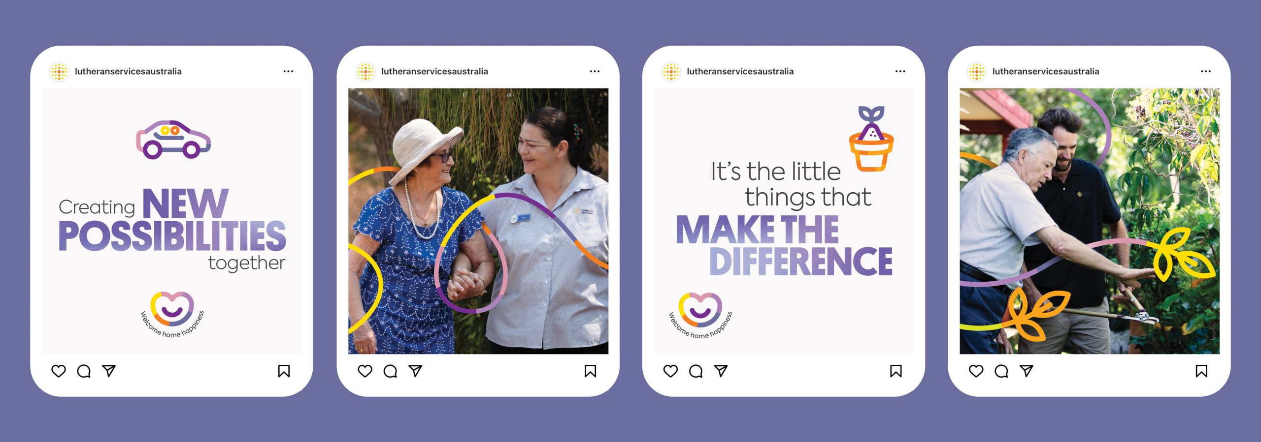
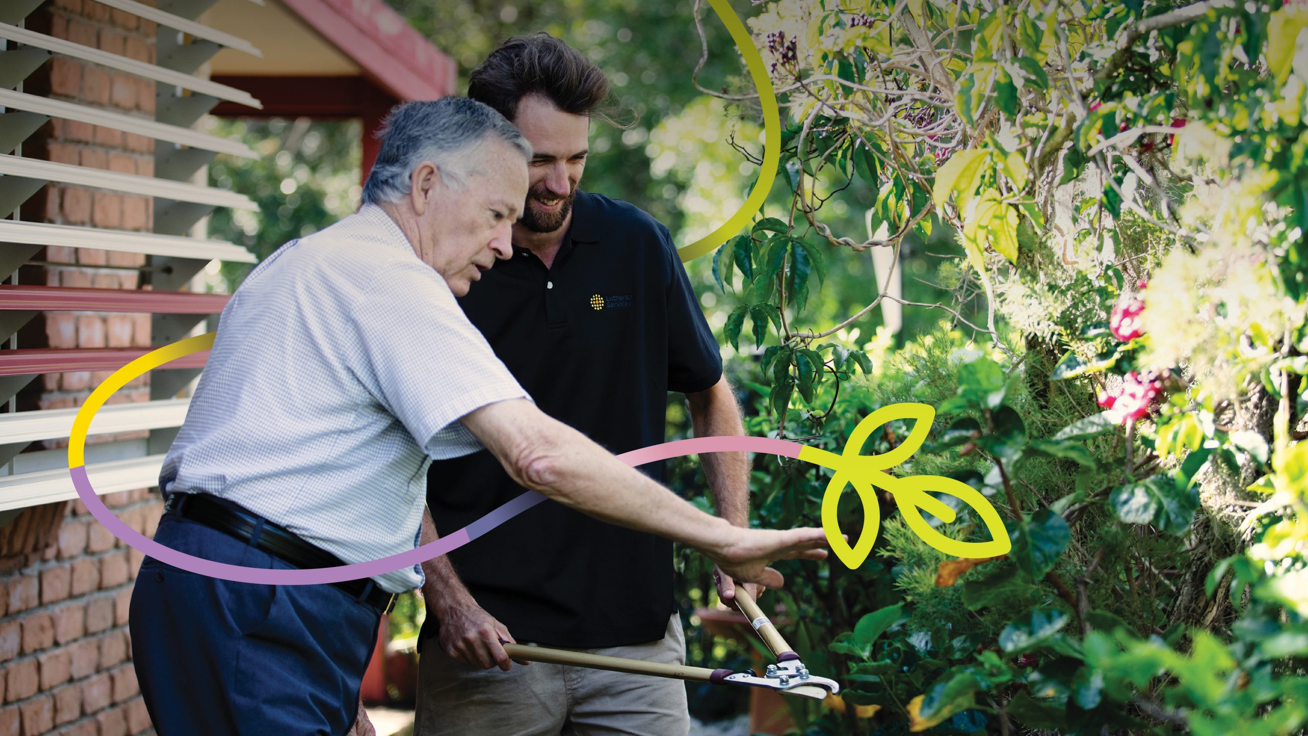
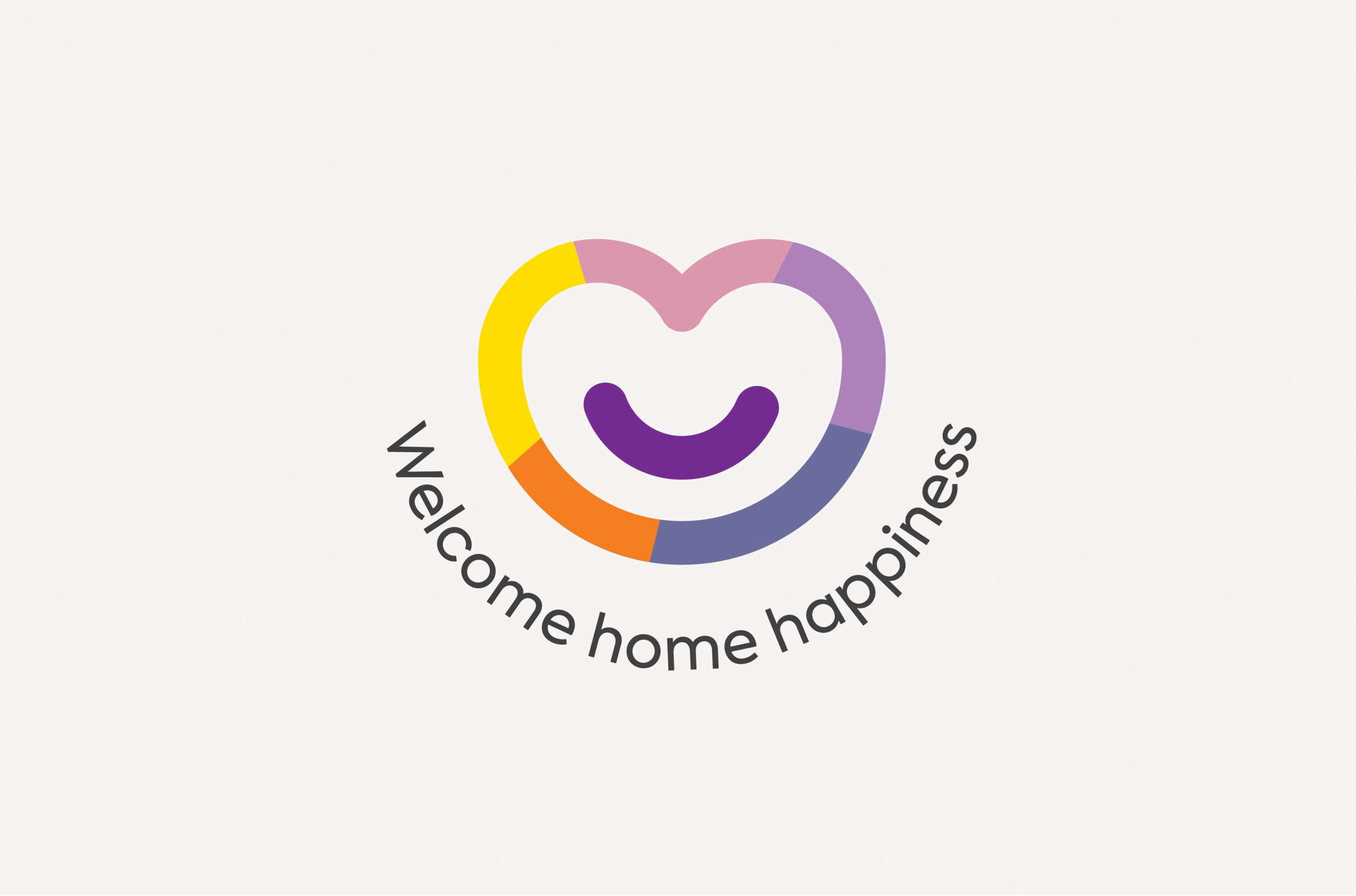
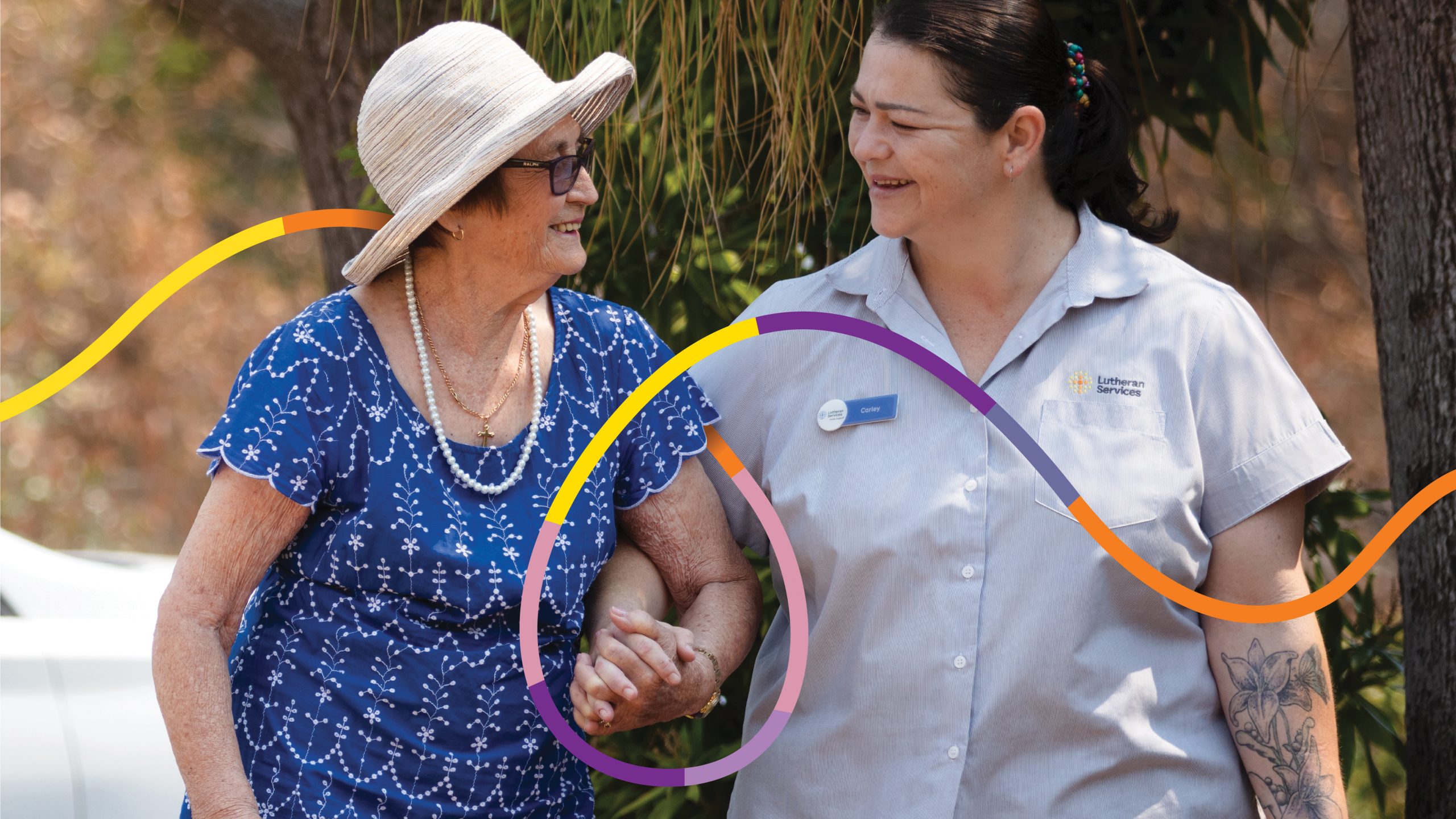
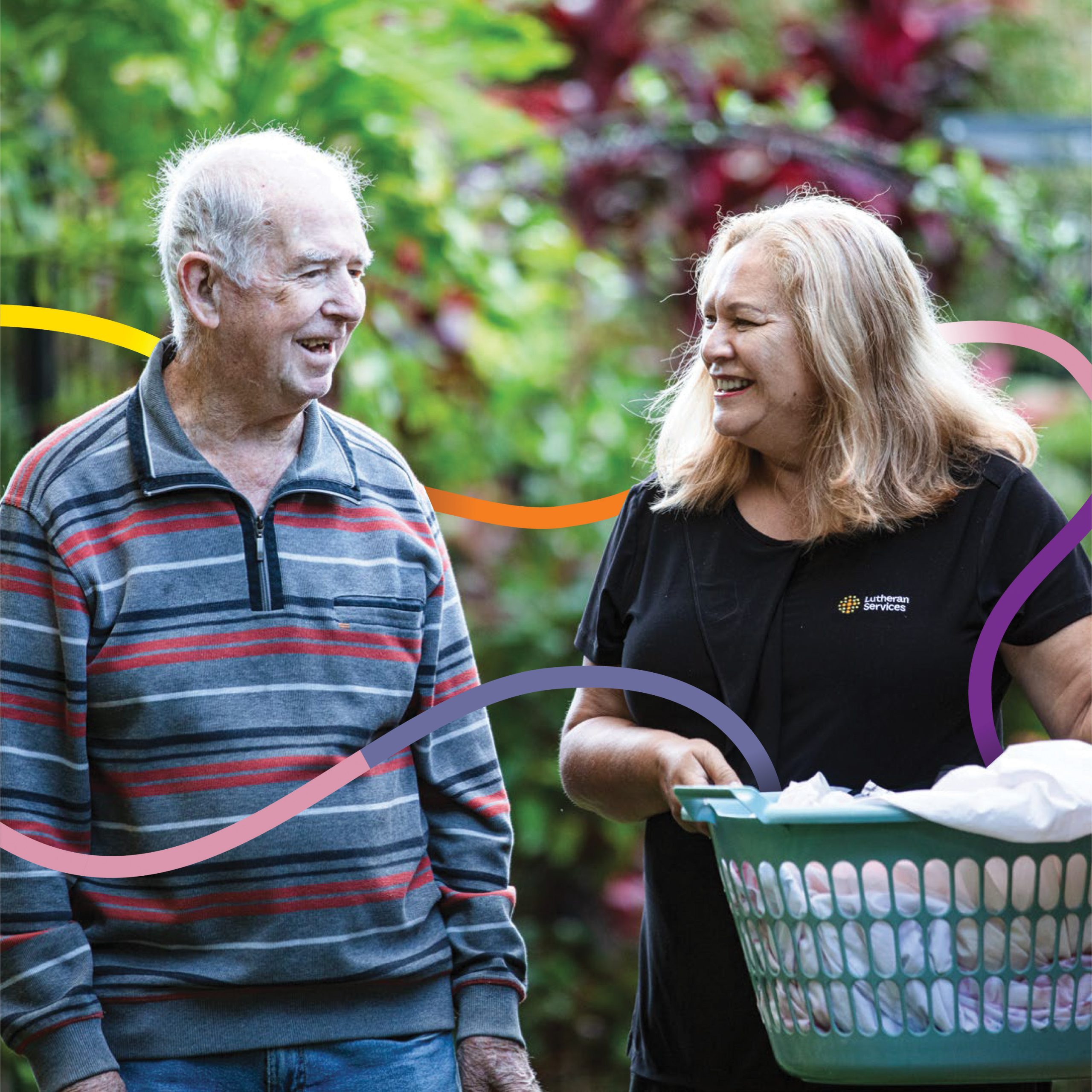
These moments of shared joy were the inspiration behind the brand concept. In it we use the device of a coloured line that blends existing Lutheran Services colours of orange, green and yellow (representing their people and teams) and the Home Care purple (which represents clients), bringing them together to symbolise the coming together and closeness of the relationship between the two.
This coloured line is then used to highlight those beautiful moments of connection in imagery e.g. holding of hands etc, as well as to intertwine people and services.
The accompanying strapline, ‘Welcome home happiness’ takes the essence of the ‘Make your heart smile’ positioning to create an invitation to prospective clients. Playing on the well-known phrase ‘welcome home’ the line has a subtle double meaning, inviting people to welcome home ‘happiness’ but also welcome ‘home happiness’, which alludes to both the emotional and practical benefits of Lutheran Services Home Care.
The impact
Joyful, warm and emotive, the Home Care brand has been embraced by the entire Lutheran Services team and is in the process of being rolled out.
The coloured line device brings together the Home Care team and client, highlighting moments of joy.


The brand is joyful, warm and colourful, emphasising the fact that this is Home Care that makes your heart smile.